The world is going mobile. The use of smartphones and tablets to browse the internet is growing at a tremendous pace. However, most of the websites are not optimized to function on multiple devices. Responsive web design (RWD) is an effective way to make a website appear great on any mobile screen.

In the past, desktops and laptops were the only thing that people made use of for viewing websites. However, with the increasing number of smartphone users, RWD has become inevitable for businesses to stay in the competition. In today’s world, users may drop a particular brand or business if they cannot find them on smartphones.
Responsive web design is an approach followed by web designing companies like Glassmedia. Such companies focus on optimizing the web pages of a website so that it can adjust to different devices and screens to provide a top-notch user experience and seamless navigation. RWD can help your website to adjust automatically to other devices regardless of the screen size and resolution.
Advantages of responsive web design
- A single website for both desktops and smartphones.
- Quick loading time means a faster website.
- A website becomes mobile-friendly, thus allowing brands and businesses to reach a larger number of target audience. (Improved visibility)
- Lower maintenance requirement.
- Increased SEO effectiveness.
- Saves time and money as only a single website needs to be maintained.
- Higher conversion rates.
Here is the step by step guide to how Impact Intractive makes a responsive web design.
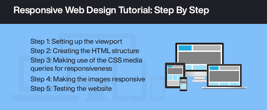
Step 1: Setting up the viewport
Web pages that need to be optimized for multiple devices require a meta viewport tag to be inserted in the head of the document. This meta viewport tag provides instructions to the browser on how to control the dimensions and scaling of the web page according to the screen size. It helps to transform the website into a RWD by adjusting the content width to the width of the smartphone screen.
One can set the following attributes on the viewport:
- Width
- Initial-scale
- Minimum-scale
- Maximum-scale
- Height
- User-scalable
Step 2: Creating the HTML structure
It involves determining the website structure by setting page layouts using a header, side bar, footer, and content container. Images and navigation elements may also be included in the HTML structure, if needed.
Step 3: Making use of the CSS media queries for responsiveness
Viewports and media queries are two important elements involved in responsive web design. Media queries help to make the website responsive and accessible on all devices. For this purpose, one needs to define certain rules and device features in the media queries. Using media queries, one can define styles depending on the page layout. Also, one can define different layouts for various smartphones screens. Media queries are nothing but simple and easy to use filters that enable one to change styles depending on the device characteristics. It is important to note that media queries must be applied based on the viewport size. Media queries may be inserted into the HTML web page or can be linked to the webpage as a separate CSS file.
Some of the commonly used parameters in media queries are:
- min-width
- max-width
- min-height
- max-height
- orientation=portrait
- orientation=landscape
Step 4: Making the images responsive
An important step in responsive web design is to make the images responsive according to the screen size and ratio. For this purpose, the images and videos are scaled according to the screen size. An important practice followed at Glassmedia is to optimize the image or video for the largest size required, and then defining the height and width in the CSS media query. The browser window is resized to find out how the images appear to fit the page.
Step 5: Testing the website
The last step in responsive web design is to test the website on various devices. Once the design and development of the website is successfully completed, it needs to be tested on various devices to ensure that it is functioning seamlessly without any technical glitches with respect to the font size, image size and content legibility. Taking feedback from others is also an effective way to find out if there is any scope for improvement.
